I’m excited to announce that the second annual Restory Conference will happen Saturday, September 16th from 9 am – 1 pm at Lake Pointe Church in Rockwall, Texas. I would love to see you there! Registration is not yet open, but watch here for details. This is the Restory Conference 2.0, and the focus will be on how to move forward toward your relationships! How can you heal from the past in such a way that you can positively approach new relationships and reconcile with old ones? Truly, the “so what” of all our stories revolves around our relationships.
I have some amazing guest storytellers coming, and some brand new messages (born out of my own journey) I’ll be unveiling at this conference.
In light of all that, would you be so kind as to vote on the imagery you like best? Keep in mind that the Restory Conference is for men and women.
1
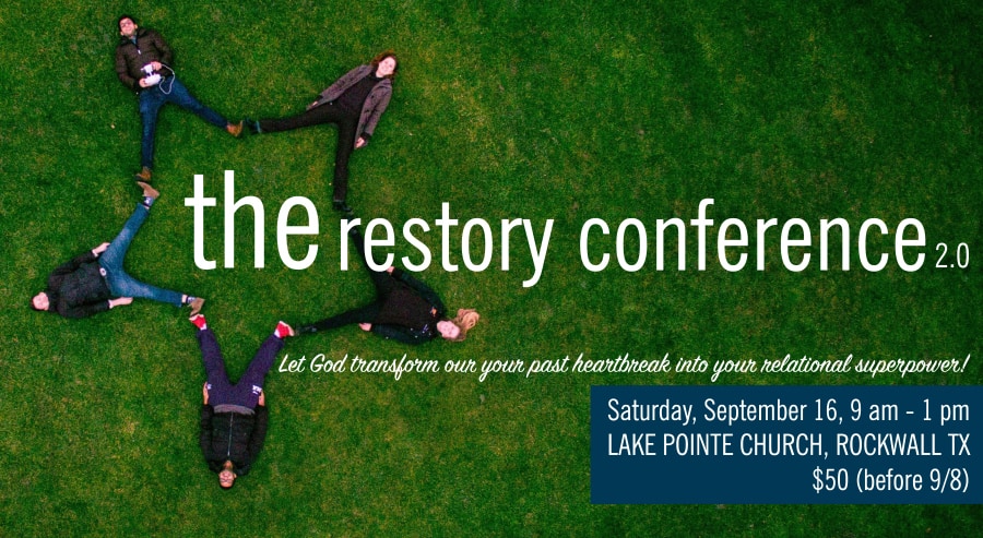
I like #1 and #4.
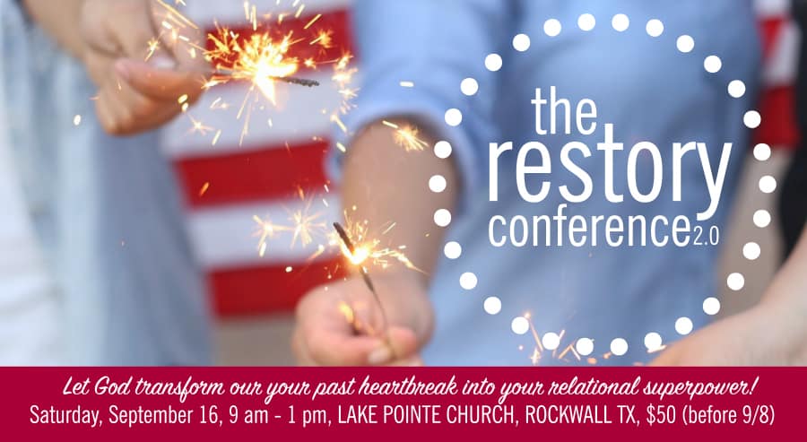
The reason for #1 is because it has the sense of Holy Spirit’s power igniting the fireworks. It is His power that is the dynamic for our change. If the word “Restore” was highlighted on #1 it would really stand out.
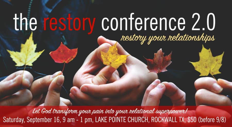
And with #4 the word “Restory” is highlighted, emphasising the purpose for the conference. Bright colours and clear lines in both of these banners will enable visibility/readability on small devices such as phones.
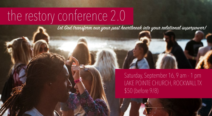
#2 & #3 don’t really catch my eye. They have darker murkier colours and harder to rate the picture to the purpose. #2 looks like a gym class and in #3 people seem to be just milling about.
They are all beautiful…but I would go for
number 4. Love the colors, the hands, the centering and the reflection of healing in leaves (Ezekiel):
Fruit trees of all kinds will grow on both
banks of the river. Their leaves will not wither, nor will their fruit fail. Every month they will bear fruit, because the water from the sanctuary flows to them. Their fruit will serve for food and their leaves for healing.”
Wish I could come. You should come do a conference like this in the Netherlands ????.
I like #3 for the people in it as in a “conference”, but I am drawn to #2 as my favorite. There’s just something about the “people star” that I like…maybe it’s the connection to one another… And really if I saw any of them, I would probably think that each one would work. 😉 Really helpful, huh Mary?! 😉
My favorite is #1, but I agree that #4 is probably best for a September event, and it’s my second choice.
While I like the image of #2, the emphasis is on the word “the.” I like #4 the best both for the emphasis on “restory” and for the fall graphic for the time of year you’re going to hold the conference.
#4. I like the way the word “restory” is a strong focus. The leaf colors work well with the color scheme.
I like #4 the best.
I like the diversity of 3 but prefer the colors and imagery of fall leaves, their colors, and the fact that they have to die off for the new leaves to appear.
I like #3 the best.
#4 best- I like the fact that there are no faces – I know the first one doesn’t either but it looks like a fourth of july invite. this one has multiple hands- community, each leaf is different but they are all together!
I like #2 for style but prefer the diversity in #3.
#2!!
I love number two with the purple but I think you might want to save it and use number four because it’s so great for fall.
These are all great. My favorite is #4, especially for a September event.
I like #1. It seems positive, energetic and brings to mind a new beginning.